My favourite design decision is usually the one that removes something.
Utrecht, NL
About
10 years in product design and UX. Built and scaled design systems at Aegon NL (5M+ customers), unifying 60+ products under one shared component library.
Indonesian by birth, Dutch because worstenbroodjes.
Outside work
Skiing. Alps when budget allows, dry slopes when not
Emerging tech. Currently building things with AI I didn't know I needed
Photography. Animals, forests, things I don't want to forget
Expertise
Product designWCAG 2.2 AAToken architectureHTML / CSSComponent API designSystems thinkingAdoption strategyStakeholder mgmtAI prototypingData analysis (GA360, Hotjar)Saying no to feature requests, politely
Aeon Design System. 60+ products unified under one shared component library. Audit, conditional logic, documentation, adoption pipeline.
View case study →
Case Study 03
Driving Adoption
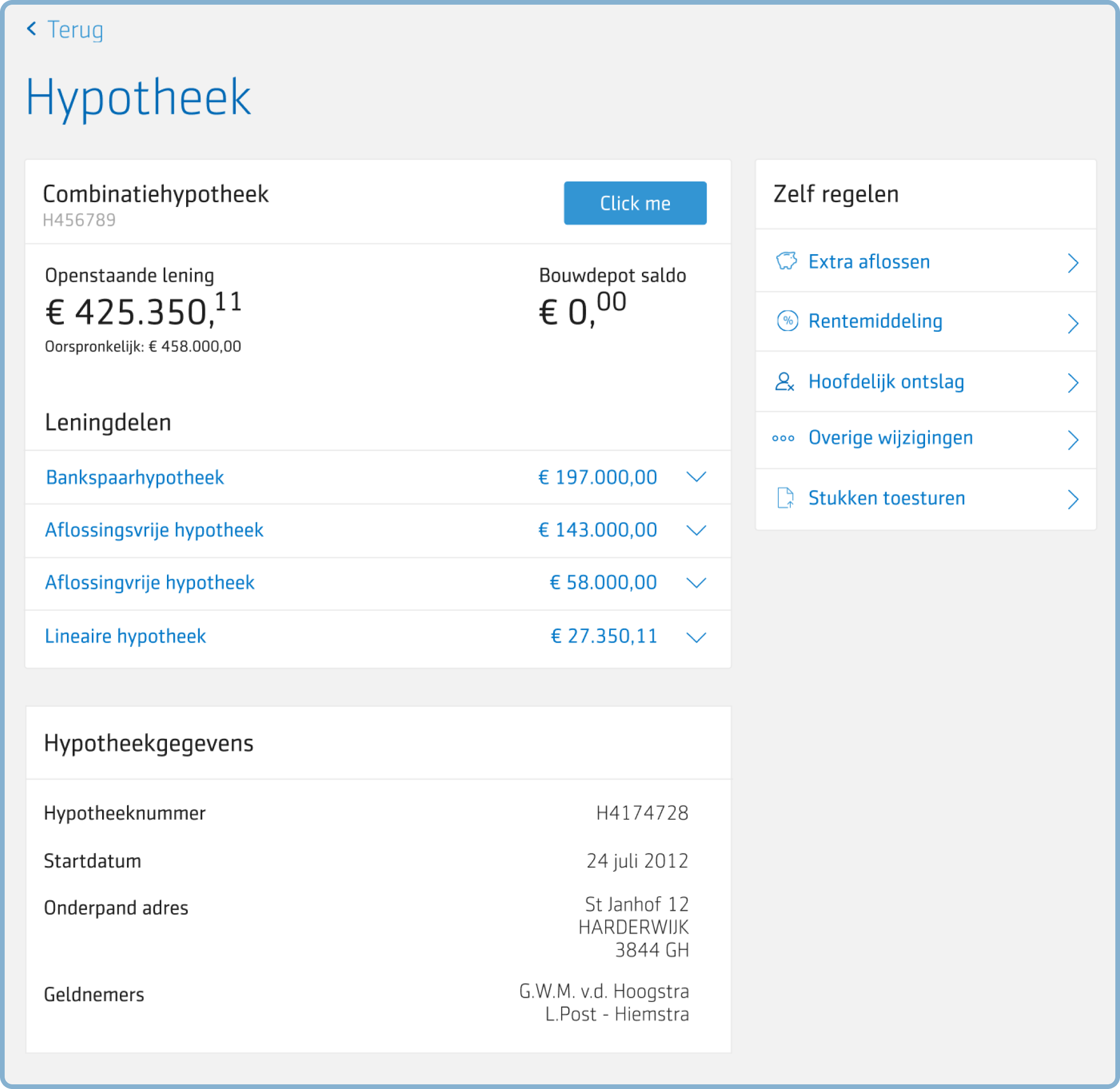
Hypotheek Data Table. When your biggest revenue team won't adopt your system. Turning a resistant team into a system advocate.
View case study →
Case Study · Enterprise B2B · Aegon
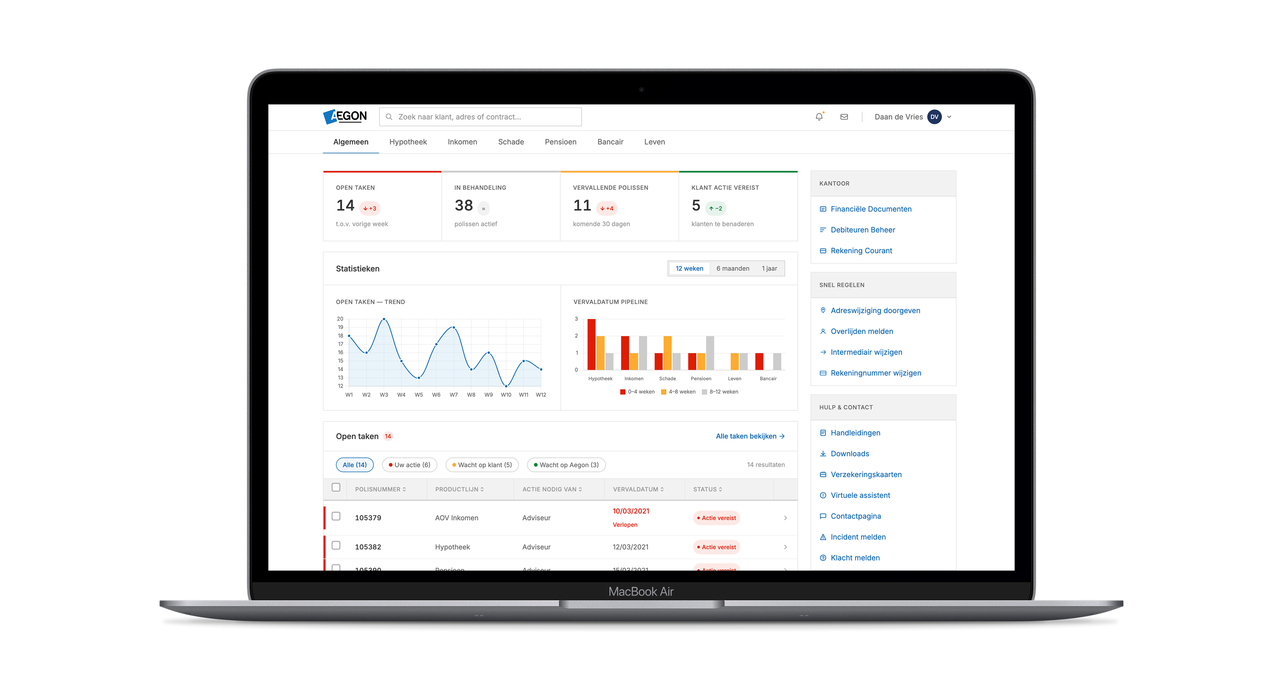
22,000 advisors. One interface for all of them.
Multi-BU portal redesign for independent insurance advisors. 18-month deadline.
Lead Designer AIPScrum of 8 · 6 BUs18-month deadline
AIP 3.0 · Aegon Intermediair Portaal
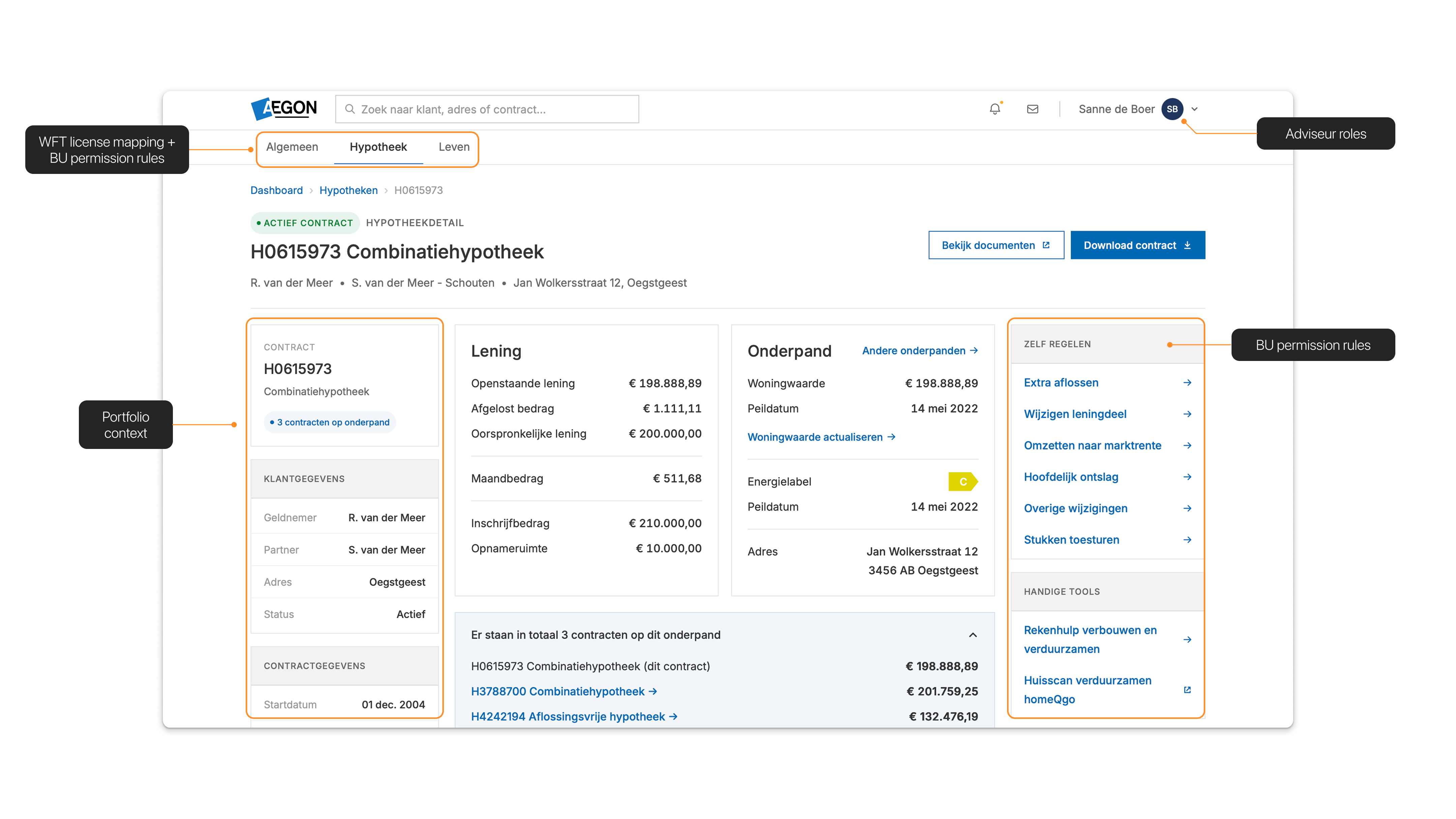
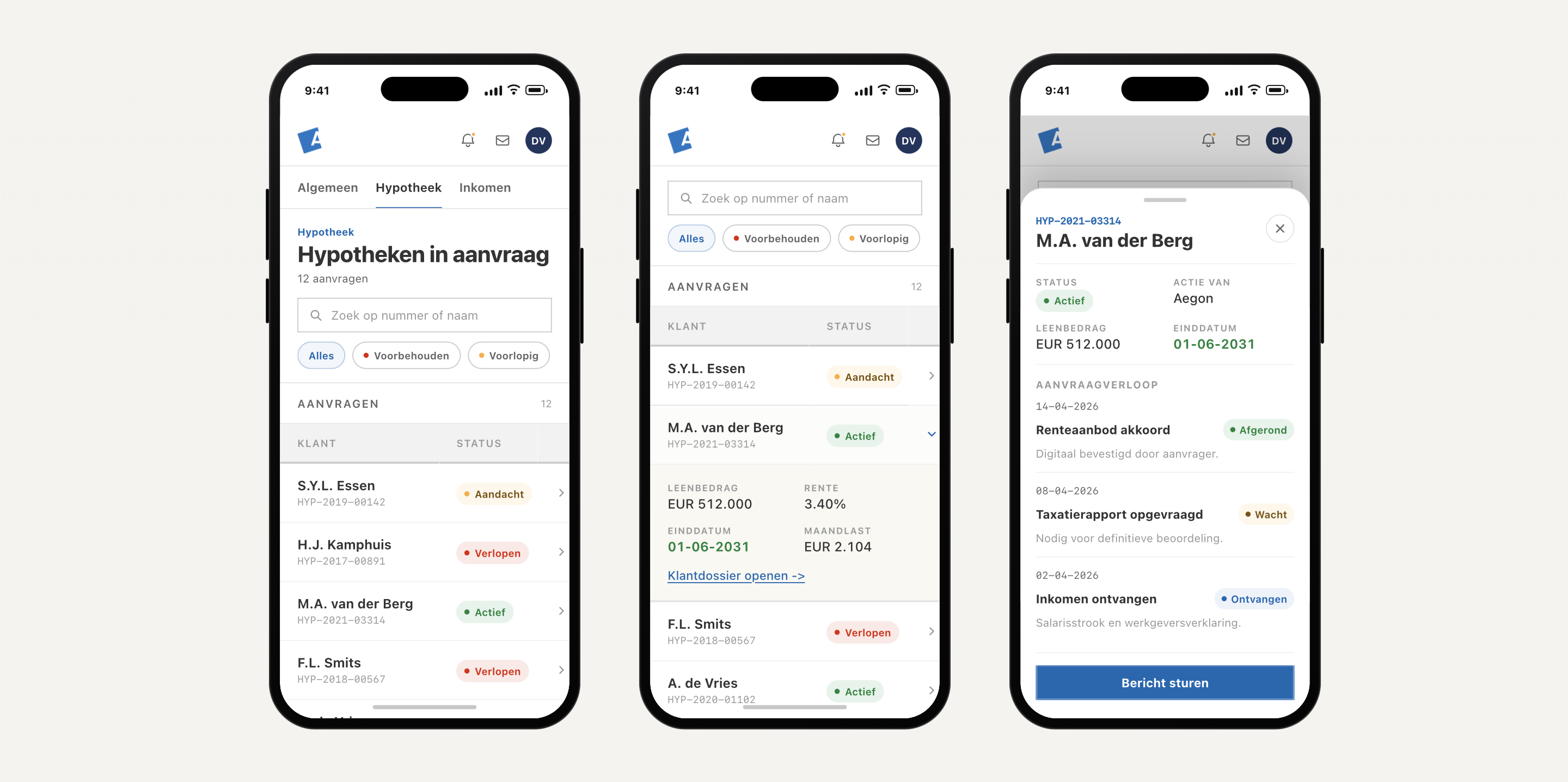
Hook with the user mismatch. 22,000 specialists treated as one audience. Set up: this case study is about how we restructured the portal from "one interface for all" to "the right interface per role" inside a hard 18-month deadline.
Problem
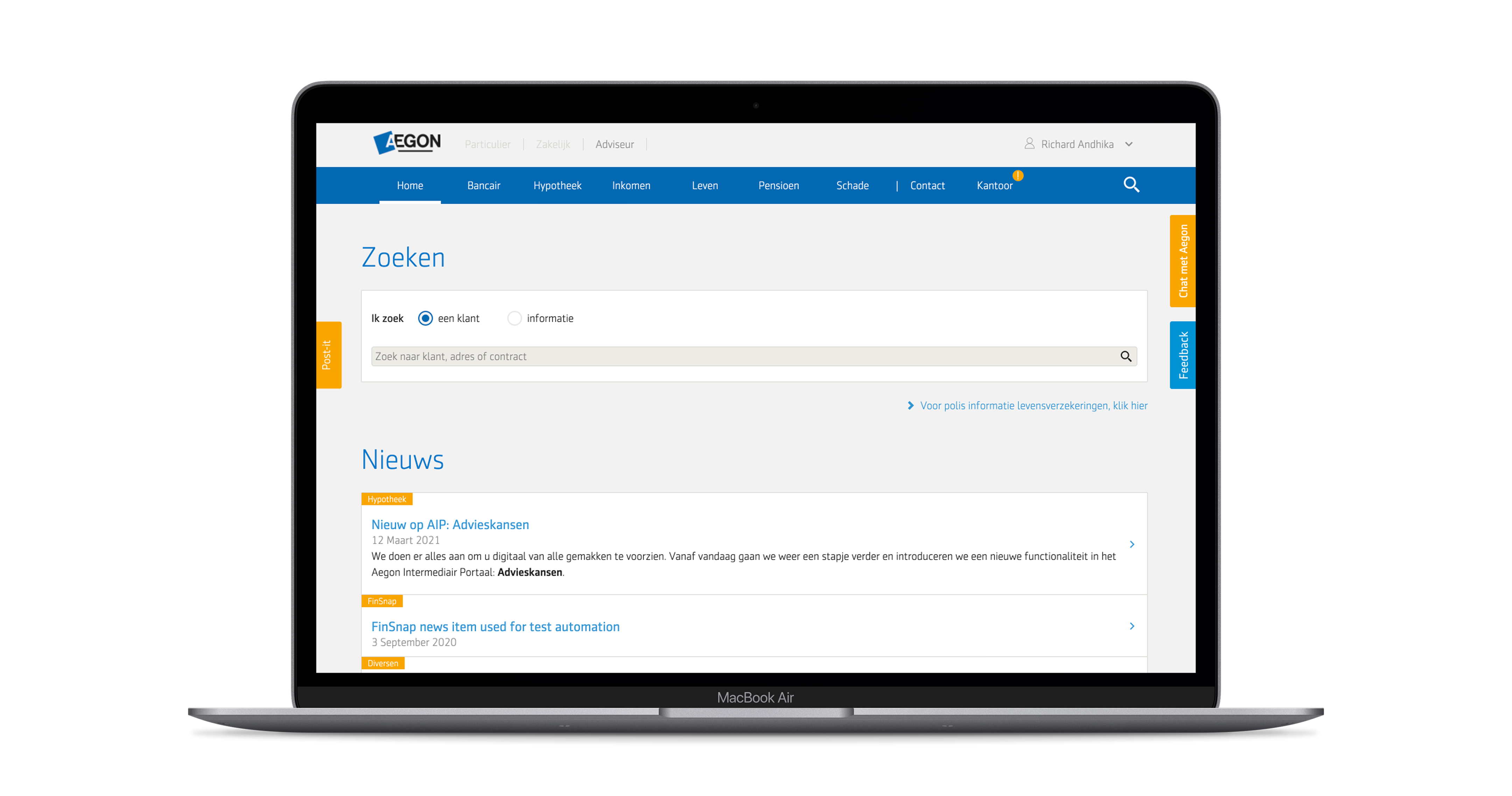
Built for everyone. Designed for no one.
AIP exposed every business unit to every advisor, regardless of WFT license(!)WFT is the Dutch financial advisory qualification. It determines which product categories an advisor is legally allowed to advise on., active portfolio, or daily workflow.
"Ik doe alleen Leven. Maar hier staat ook gewoon Schade, Pensioen, alles."
"Er staat zoveel in dat menu. Ik weet eigenlijk niet eens wat de helft is."
"Ik open het en zie meteen tien dingen die ik nooit nodig heb. Alles staat door elkaar."
TaskRestructure AIP so advisors could get to the right client, the right product, the right task faster.
Frame the problem qualitatively here — one portal, every link, every advisor. Then the brief: restructure for relevance without rebuilding every BU flow. The next two slides answer "how did we know" (evidence) and "how bad was it" (the numbers).
Evidence
The interface wasn't broken. It was role-blind.
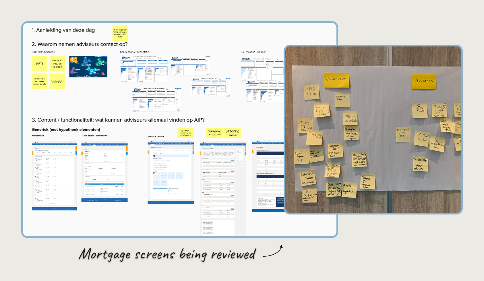
Three months triangulating analytics, session recordings, and advisor interviews surfaced a structural insight, not a visual one.
01
Behavioral analytics
GA360 · 12-month window · all advisors
02
Session recordings
Hotjar · 200+ tagged sessions by BUs
03
Advisor interviews
50+ advisors
Synthesis insight
"Different advisor profiles were running on one undifferentiated portal. Every link visible to everyone, every session."
GA360 nav engagement
GA360 analytics
Scope map
Affinity map
The insight slide. Lead with the reframe: "the interface wasn't broken, it was role-blind." Method matters but don't dwell on it. The synthesis quote is the entire point: different advisor profiles, one screen. That's the structural mismatch that makes everything that follows feel inevitable rather than designed.
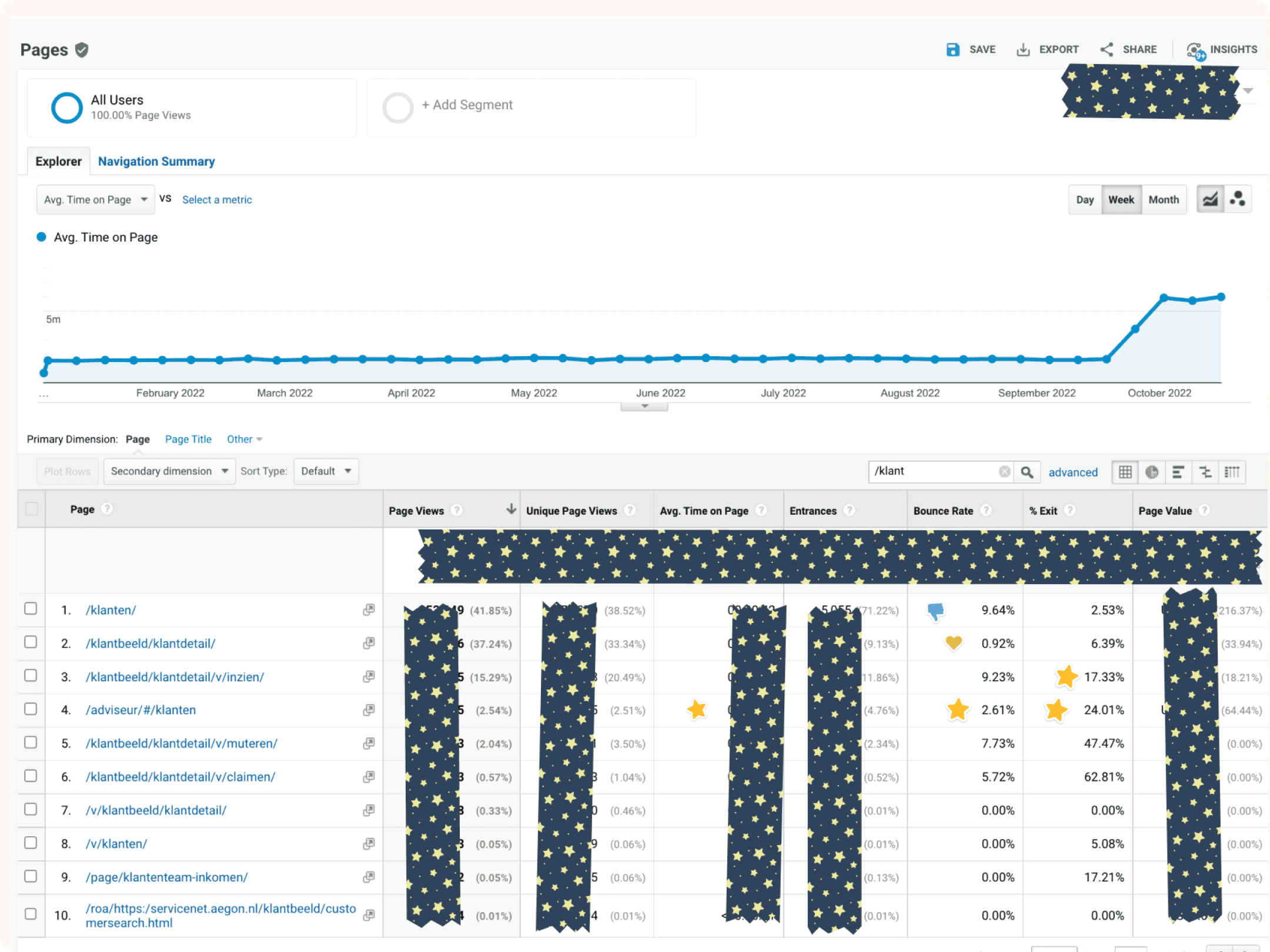
By the numbers
One portal. Three ways it failed advisors.
The role-blind architecture wasn't a hypothesis. It showed up in every layer of the data.
85%
of interactions landed on 5% of nav links
GA360
3
clicks to search a new client mid-session
Heatmap sessions
6
BUs visible to every advisor, regardless of role
Portal audit
20+
tasks handled per advisor, on average
GA360
Lead with the numbers in order. The 85/5 split is the headline — read it slowly. The "6 BUs visible regardless of role" is the structural cause; the others are symptoms. Bridge to next slide: "Three moves, one for each of these pain points."
Approach
Three design decisions, mapped to three advisor pain points.
We explored routes, prototyped the risky parts, then kept the decisions that changed what advisors could find, decide, and do.
01
Persistent customer search
Always one input away.
addresses3 clicks · search depth
02
WFT-scoped navigation
Only the business units this advisor is licensed for.
addresses6 BUs · no role scope
03
Role-aware dashboard
Per-role task context: pending actions, active portfolio, BU metrics.
addresses85% / 5% · nav imbalance
Frame this as "one move per pain point we just saw on the previous slide." The three numbers (3 clicks, 6 BUs, 85/5) reappear as connectors. The DS reuse footer is the strategic lever, not a deliverable. Don't dwell on it; the impact slide closes that loop.
drag to reveal
AIP · Before & After
From 6-BU mega-nav to role-scoped workspace.
Left: AIP 2.0 · every business unit, every link, surfaced to every advisor. Right: AIP 3.0 · only the BUs this advisor is licensed for, with persistent search and a personalized landing.
Drag the slider live during the talk. Pause on the half-open state to show the contrast in nav density. Don't read the caption. Just say "old left, new right" and let the visual carry it.
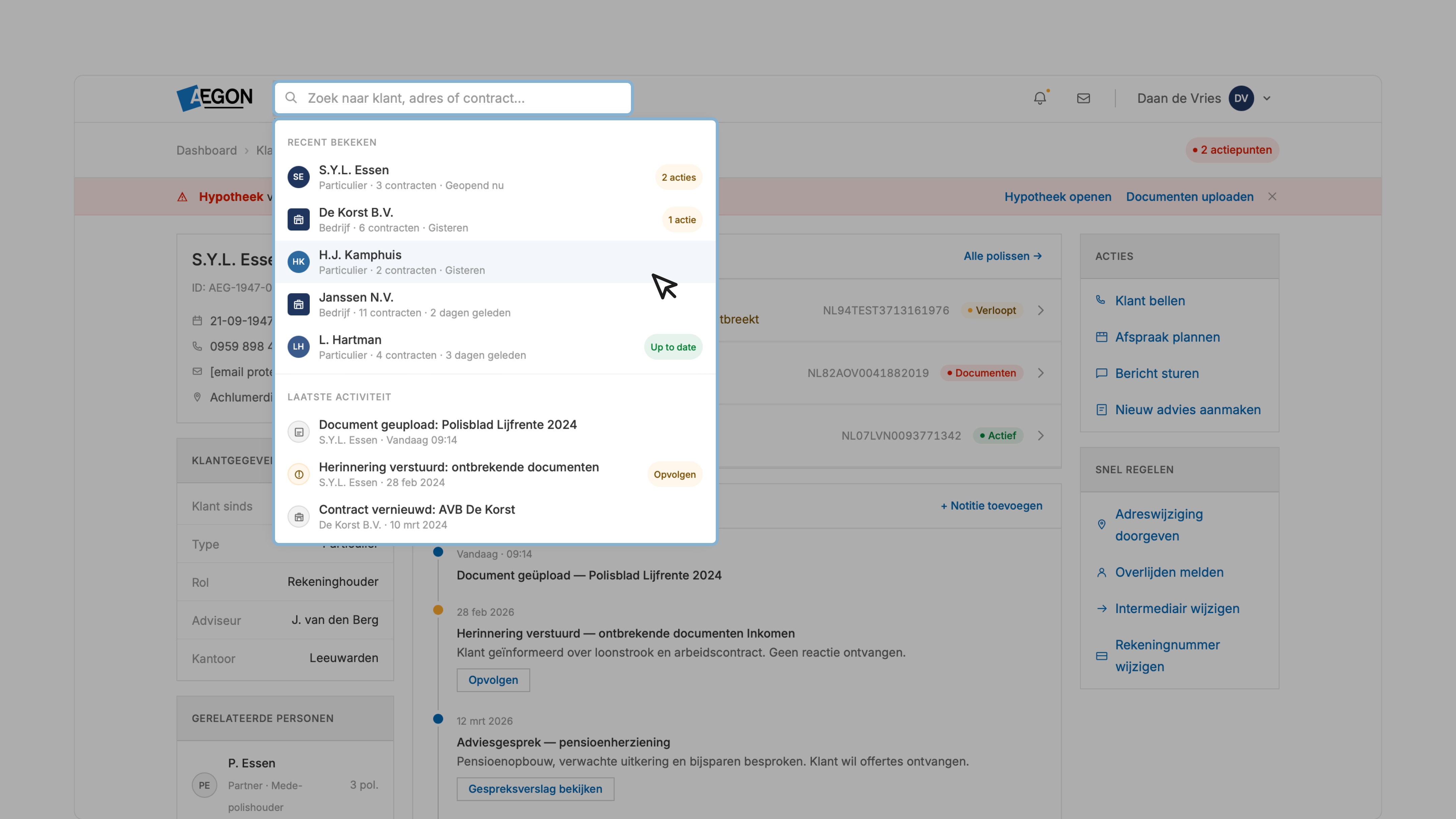
Persistent search
Search is a tool, not a destination.
A persistent field in the top bar, always visible, with recent searches and recent clients.
Talking point: this was the most contested 48px in the build. Engineering wanted it collapsible. Testing said advisors would never expand it. We won the argument with click-path data: search was the backbone of the workflow, not a feature.
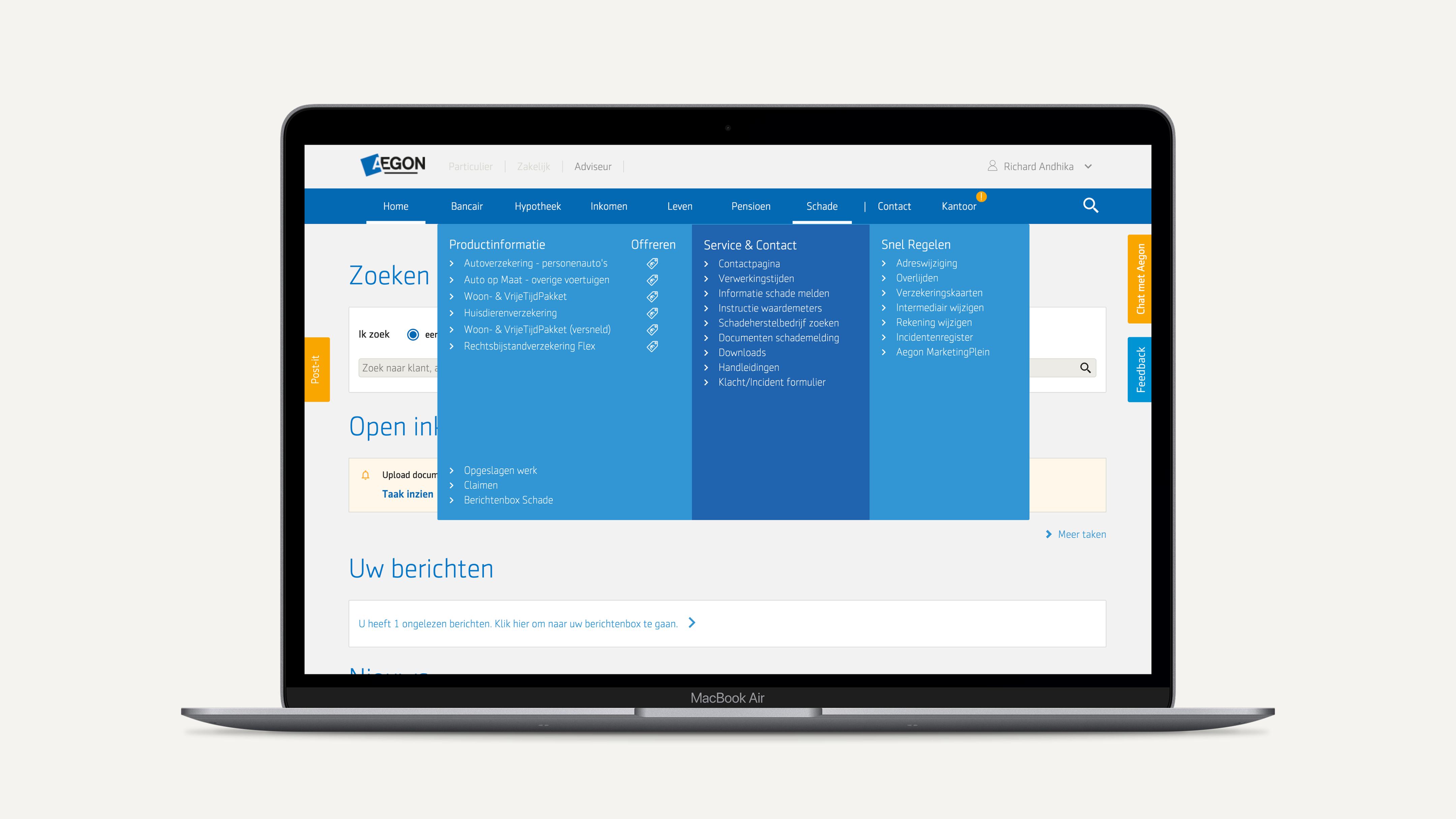
WFT-scoped navigation
Only what this advisor is licensed for.
Hiding an unlicensed business unit is good UX and good compliance.
I made the case in compliance terms: showing unlicensed BUs created exposure we didn't need. That reframing turned a UX argument into a risk argument and got it funded.
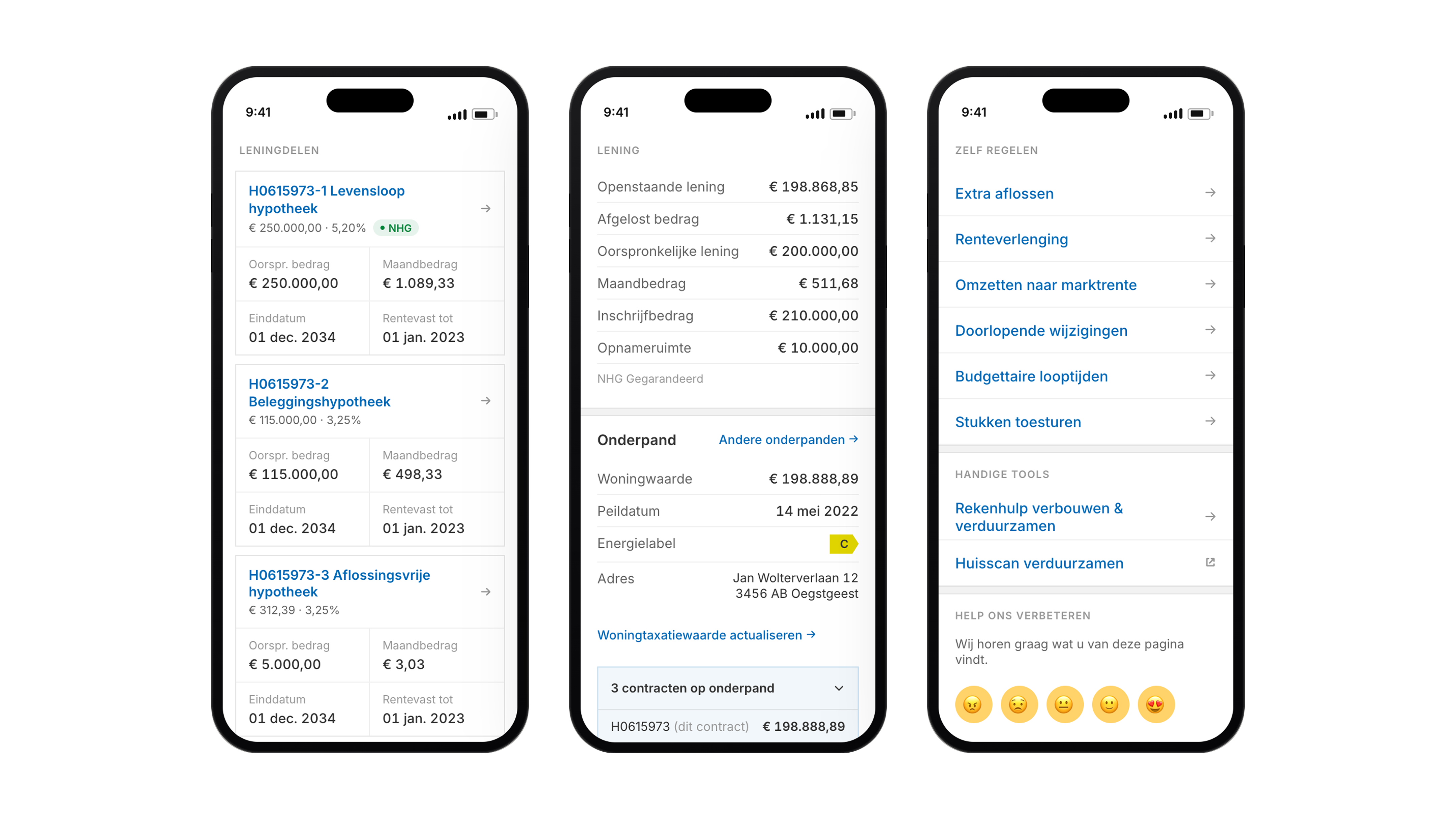
Role-aware dashboard
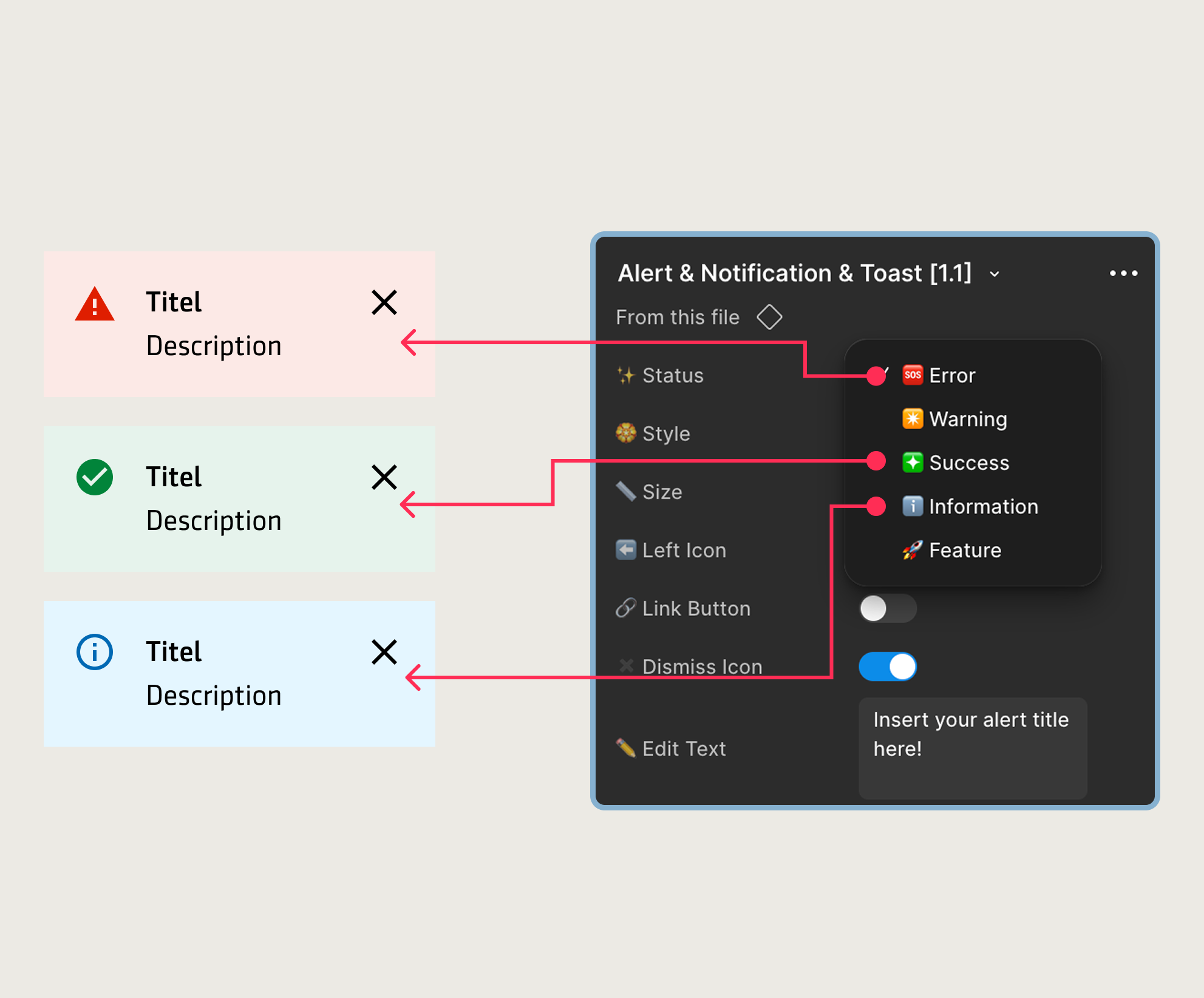
Use this as the second proof point: not only fewer links, but a landing surface that helps advisors continue the right work immediately.
Decisions
What shipped. What I killed in testing.
● Shipped3 decisions
Persistent customer search
Always visible in the top bar, with recent searches and recent clients.
WFT-scoped navigation
Only the business units this advisor is licensed for.
Role-aware dashboard
Per-role task context with pending actions, active portfolio, and BU metrics.
✕ Killed in testing1 concept · before engineering
Loved internally. Wrong in use.
The full-page search concept destroyed nav context in testing. Advisors lost their place mid-task.
The single most important slide for this case study. Lead with what got cut, not what shipped. That's the senior IC signal. The full-page search bar was a stakeholder favorite; it died in usability testing. We did not bring it back. That's a discipline question, not a design question.
Delivery
18-month deadline. Four validation gates.
Each phase shipped only after the previous one validated against advisors and stakeholders.
01Jul – Sep
02Oct – Dec
03Jan – Mar
04Apr – Jun
Live
Design
Research synthesis · structural reframe · BU alignment
Persistent search · full-page search bar concept
Role-scoped dashboard · WFT nav
Cross-platform content flow · in-portal story pages
Phased rollout · 22,000 advisors
Validate
Stakeholder sign-off across 6 BUs Gate passed
Search proven in testing
Full-page bar
Gate passed
Tested with advisors · WFT scoped Gate passed
Journey moved to aegon.nl
Portal content
Gate passed
90%+ DS adoption · 6 months early Shipped
The phased rollout proves "I ship programs, not screens." Each gate was a real go/no-go decision: the cross-platform validation phase is what killed the content pages. Don't apologize for the linear timeline; it's a feature, not a constraint. If asked "what if a gate had failed?" The honest answer is we'd have re-scoped, not pushed the deadline.
Outcomes
Shipped in 12 months.
Load time down 46%.
Advisors on task up 60%.
Read the middle metric carefully. Frame it as session quality: advisors stopped browsing; they started working. The strategic close is not just 12-month delivery, but 6 months ahead of the original plan. DS reuse was the tool, not the deliverable.
Reflection
What worked. What I noticed too late.
What worked
What I noticed too late
The reframe was the project
"Role-blind, not cluttered" is what made the three moves obvious. Without it, we'd have shipped a tidier version of the same problem.
I trusted GA360 before I trusted advisors
The insight was in the interviews first. I weighted the quantitative read too early. Next time the qualitative gets equal weight from day one.
DS reuse wasn't garnish. It was the timeline.
90%+ reuse is the only reason we could turn an 18-month plan into a 12-month delivery.
Role taxonomy was too clean
WFT licenses gave us a defensible scope. They also flattened assistants, back-office and team leads into edge cases they weren't. Around 15% of sessions.
Close on the right column, not the left. "What I'd change" is the senior signal. Interviewers read maturity from self-criticism, not self-praise. The three change items are real, specific, and procedural. Not platitudes.
Case Study 02 · Design Systems · Aegon
Aeon Design System. 60+ products, one system.
Shared component architecture across Aegon NL products. Built to be adopted, not admired.
Design System DesignerAegon NL · 5M+ customers2 senior UX designers + 3 engineers + PO
Aeon Design System
Problem
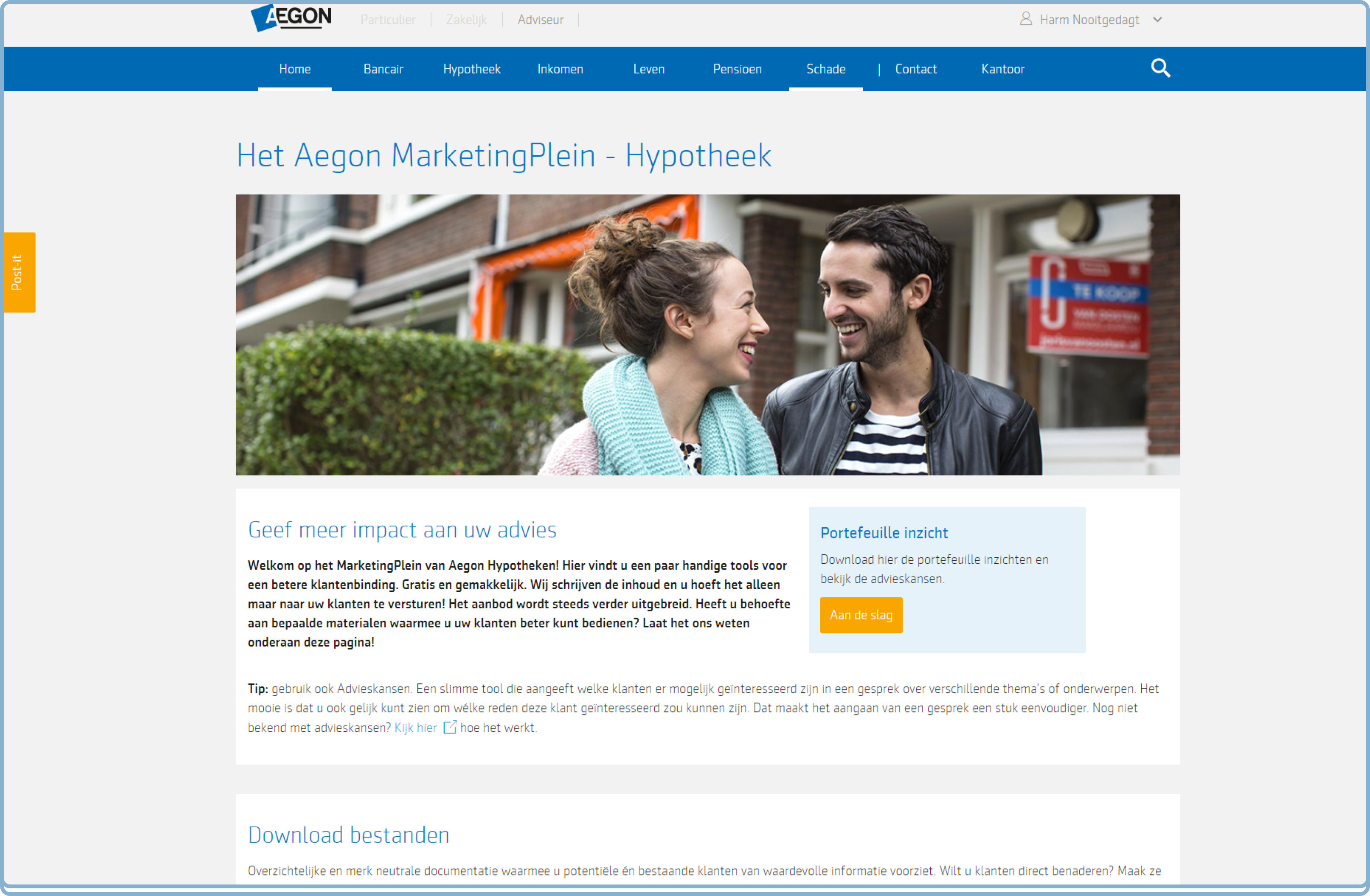
Every team had a button. None of them had the same button.
Each platform built independently. No shared components, no token language, no documentation. Every team solving the same problems in isolation.
Role · What I owned
Component audit + architecture
Auto-layout + conditional logic
Stakeholder alignment
Component brief template
Adoption strategy
Documentation guidelines
Semantic color tokens
Evidence
drag to reveal
AIP · Before & After
The same portal. Four years apart.
Left: AIP 2.0, each business unit shipping its own patterns. Right: AIP 3.0, one token system, one component set, 22,000 advisors on a consistent interface.
Aeon Design System
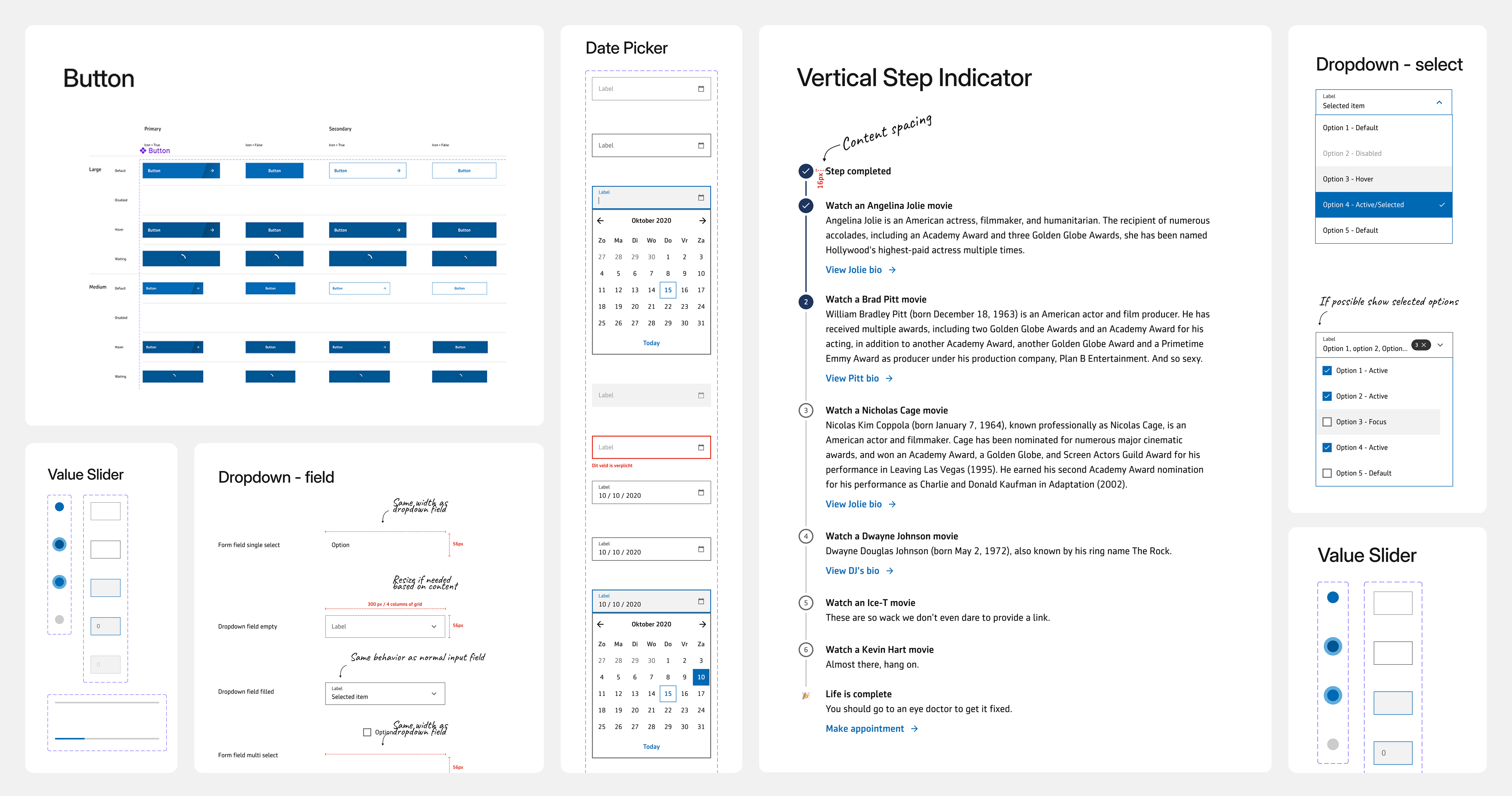
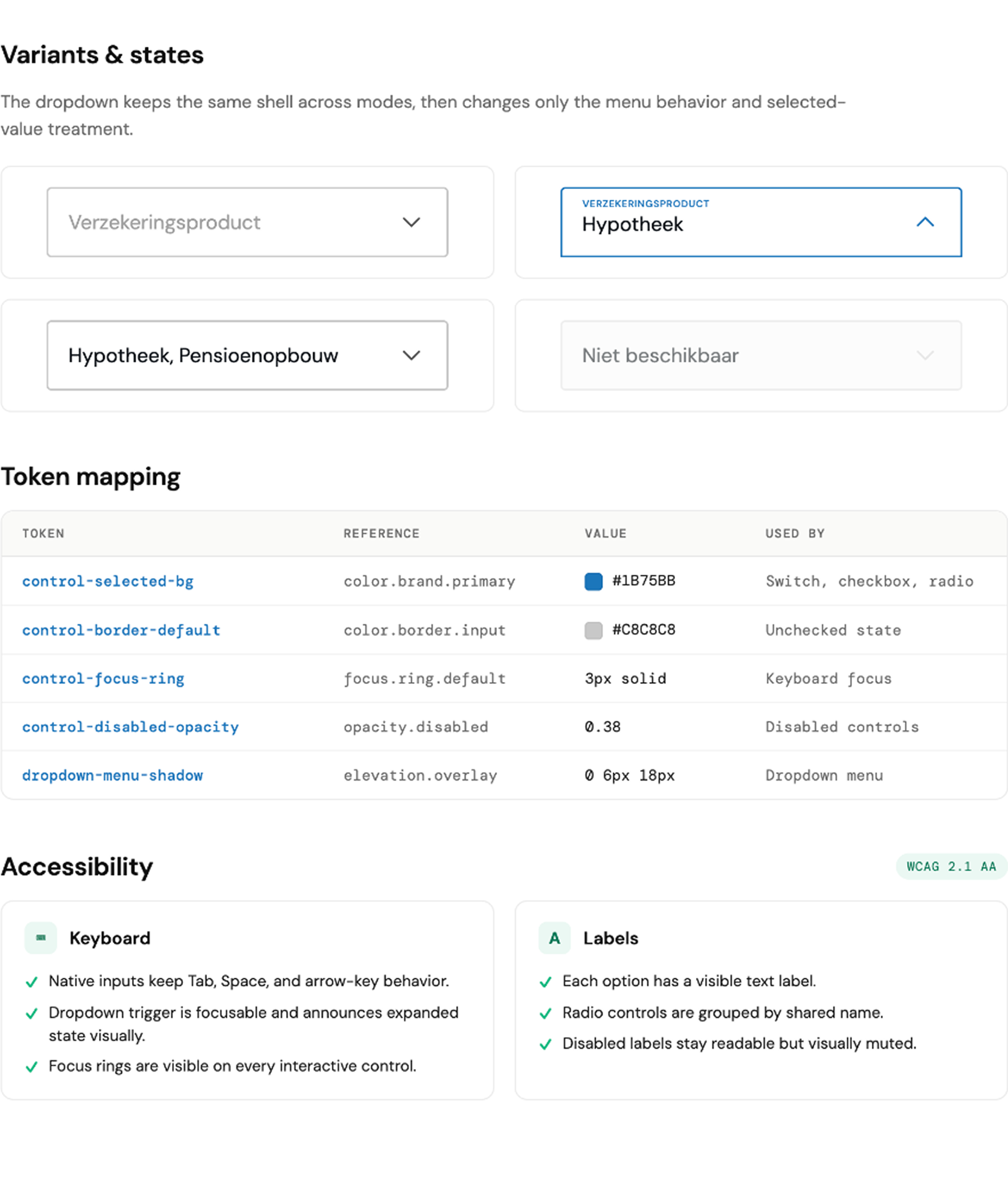
From 47 variants to one shared language.
Buttons, fields, date pickers, step indicators. Every component documented with states and usage rules. Built for three platforms.
Buttons
Hypotheek Portaal
Before · Fragmented state
Aeon · Buttons
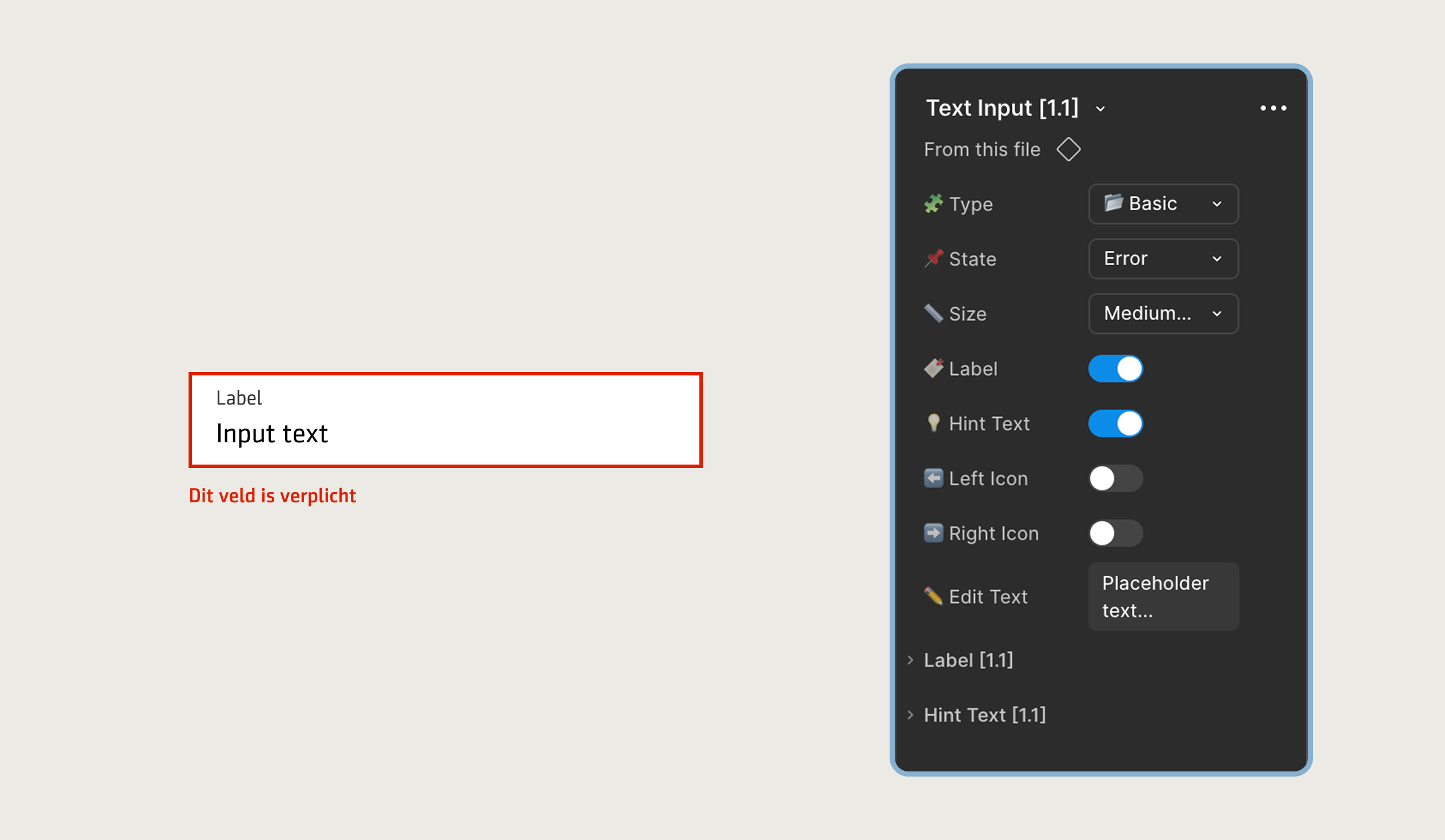
Text Input
Beleggingsplatform
Voer een geldig IBAN-nummer in
Before · Fragmented state
Aeon · Text Input
Naam
Postcode
IBAN
Dropdown
Life & Pensions
— Maak een keuze —
Nieuwe hypotheek
Oversluiting
Verhoging
Omzetting
Rentewijziging
Oversluiting
Nieuwe hypotheek
Oversluiting
Verhoging
Omzetting
Rentewijziging
Before · Fragmented state
Aeon · Dropdown
Badges
Pensioenportaal
ActiefIn behandelingWachten op klantConceptVervallenInactief
Polisnummer
Product
Status
P-00234718
Pensioen
Actief
P-00198443
Lijfrente
In behandeling
P-00312050
ORV
Wachten
Before · Fragmented state
Aeon · Badges
Status badges
PrimairSecundair
Fout
Geldig
Waarschuwing
Filter pills
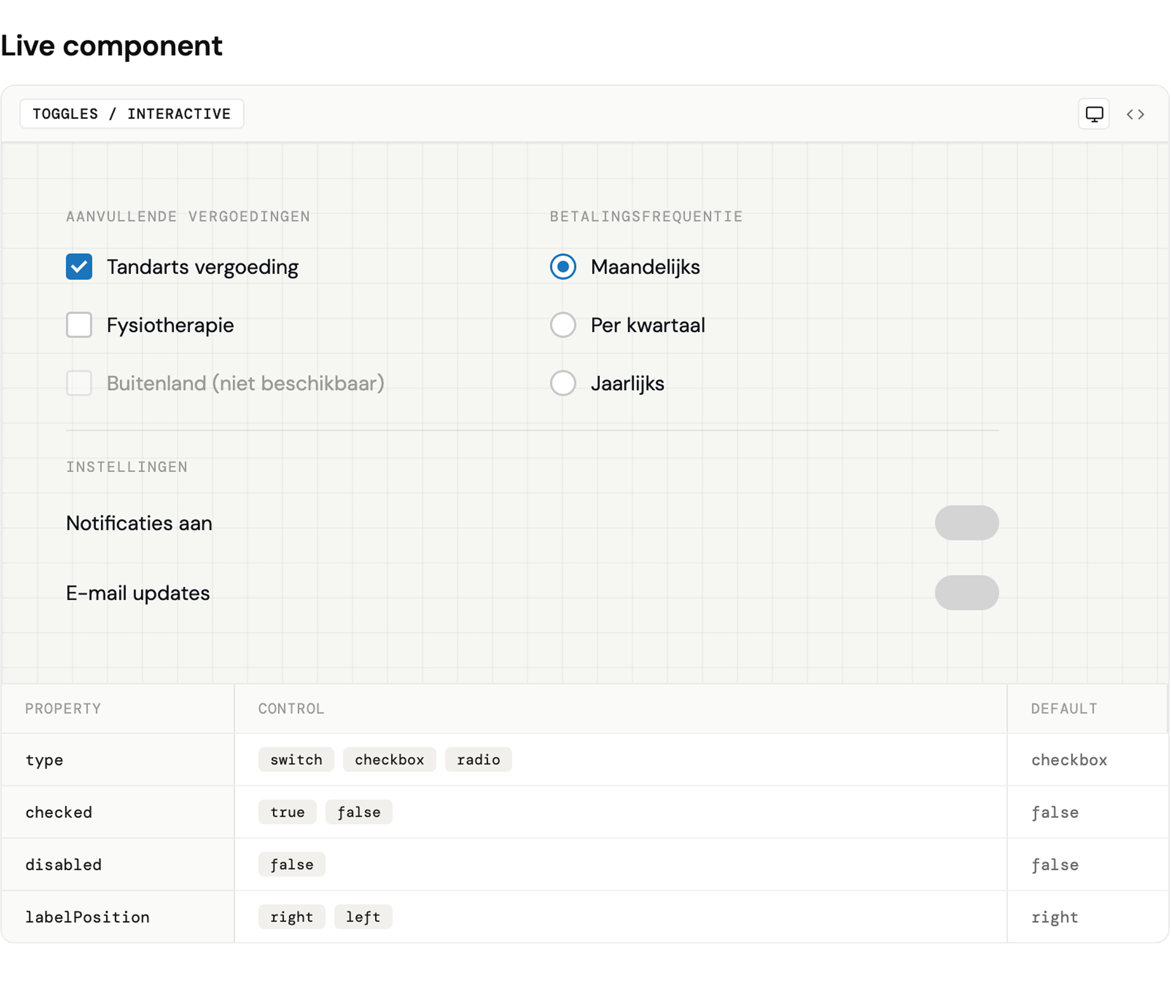
Toggles
Zorgverzekering
Vergoeding aanvragen
Wijziging
Niet beschikbaar
Notificaties aan
E-mail updates
Before · Fragmented state
Aeon · Toggles
Aanvullende vergoedingen
Betalingsfrequentie
Interactive slide. Click any card to reveal the Aeon version.
Architecture
Three platforms. One component.
Platform-specific Field variants were replaced with a single component driven by context flags. Reduced build surface, eliminated drift, and cut load times by 25%.
Documentation & Adoption
Docs nobody read. Then docs they pointed to.
Scattered, inconsistent, rarely referenced. I restructured the system documentation: usage guidelines, do/don't examples, token mapping, team contribution notes. 89% of adopting teams pointed to documentation as the reason they could switch without slowing down. The number that mattered most wasn't measured. It was repeated.
Outcomes
Form completion up 25%.
Dev time down 40%.
Component adoption above 90%.
Sources
GA360, baseline vs post-rollout·Dev lead reports across 3 teams·Tracked screens, 3 teams, rollout phase 1
Case Study 03 · Design System Adoption · Aegon
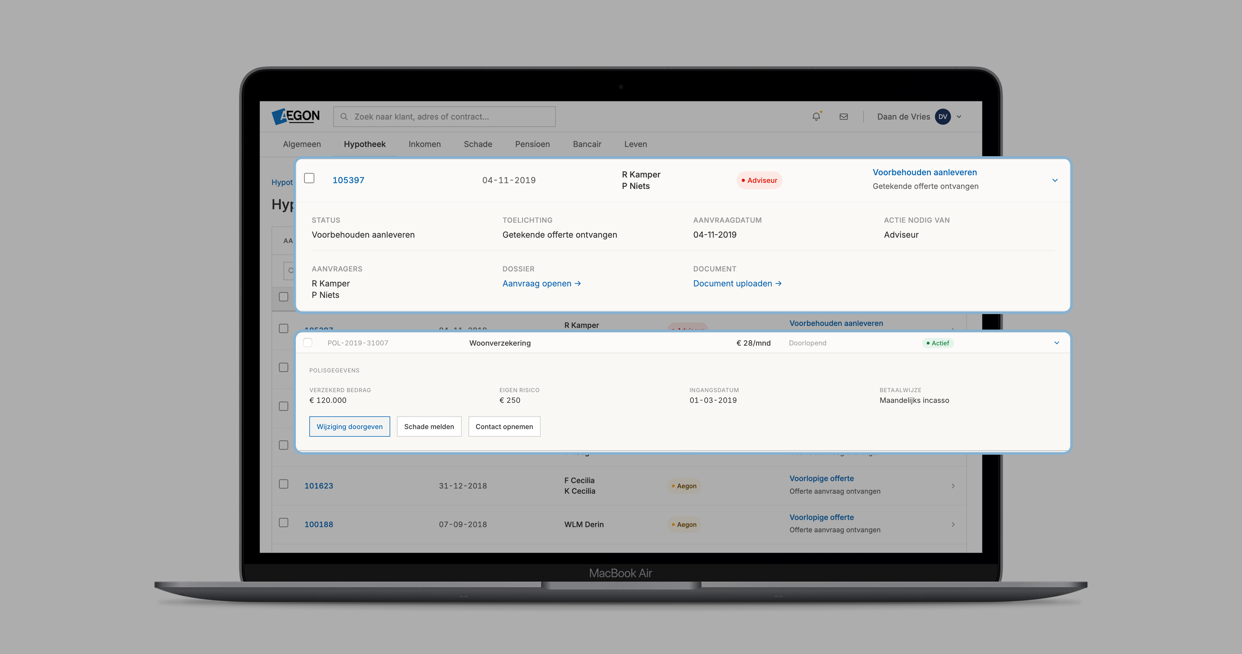
The Data Table they wouldn’t adopt. Shared structure, local complexity.
Turning a resistant revenue team into design-system partners without flattening their domain complexity.
Design System DesignerAegon NL · 5M+ customers2 senior UX designers + 3 engineers + PO
Hypotheek Data Table
Timeline note: CS1 and CS2 ran concurrently. Hypotheek adoption began in the final phase of the Aeon build, not after it completed.
Problem
Largest revenue team. Openly resistant.
"Our tables are too complex for your system."
"We can't wait weeks for approvals."
"We'll miss deadlines if we have to conform."
Insight
"I'm not asking you to simplify mortgages. I want to simplify everything that isn't mortgage-specific."
Evidence
70–80% was standard. Just wasn't packaged for them.
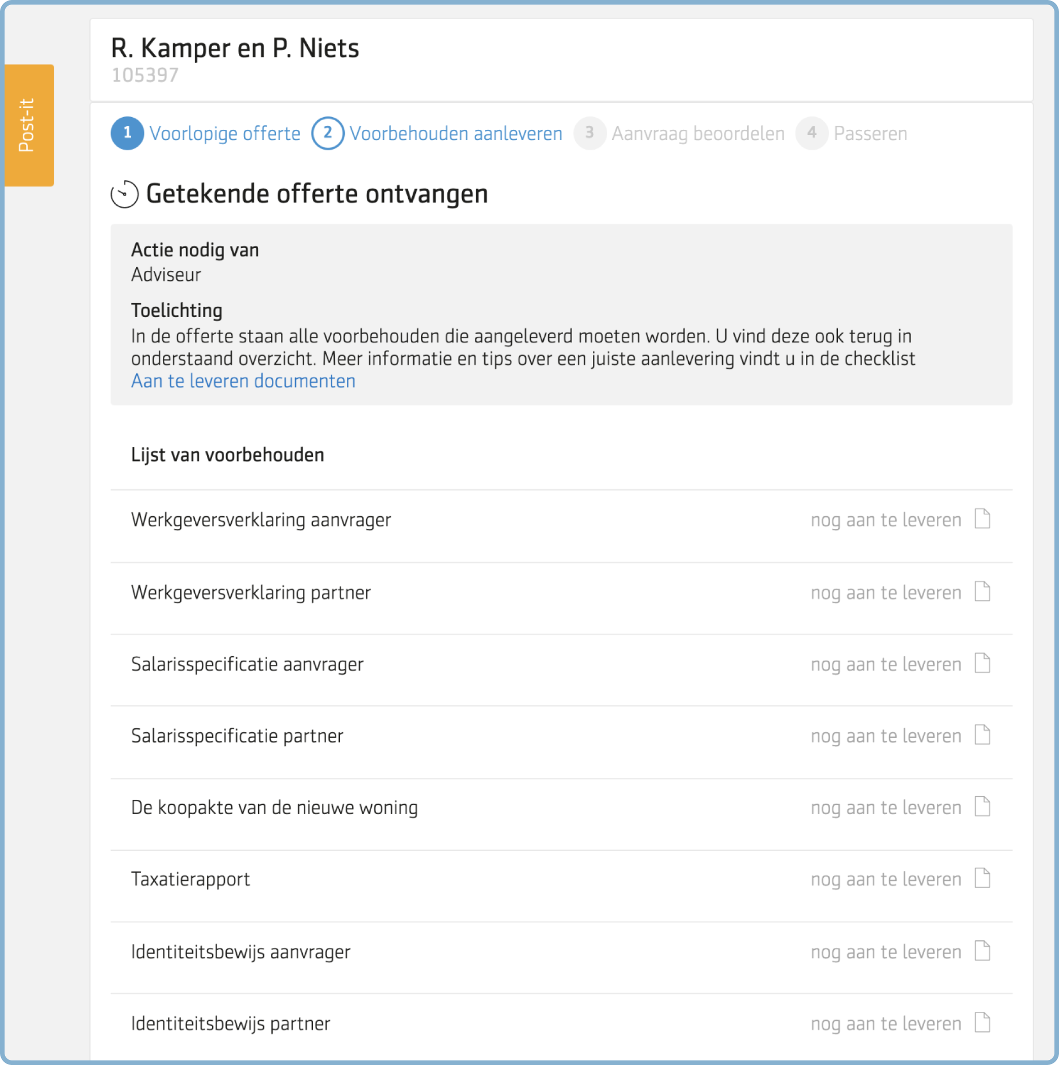
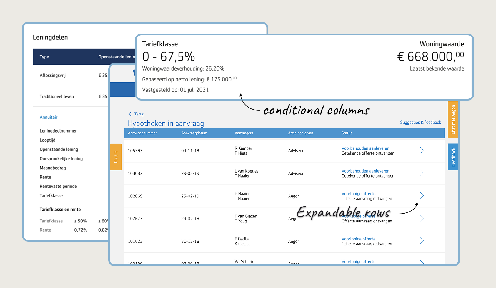
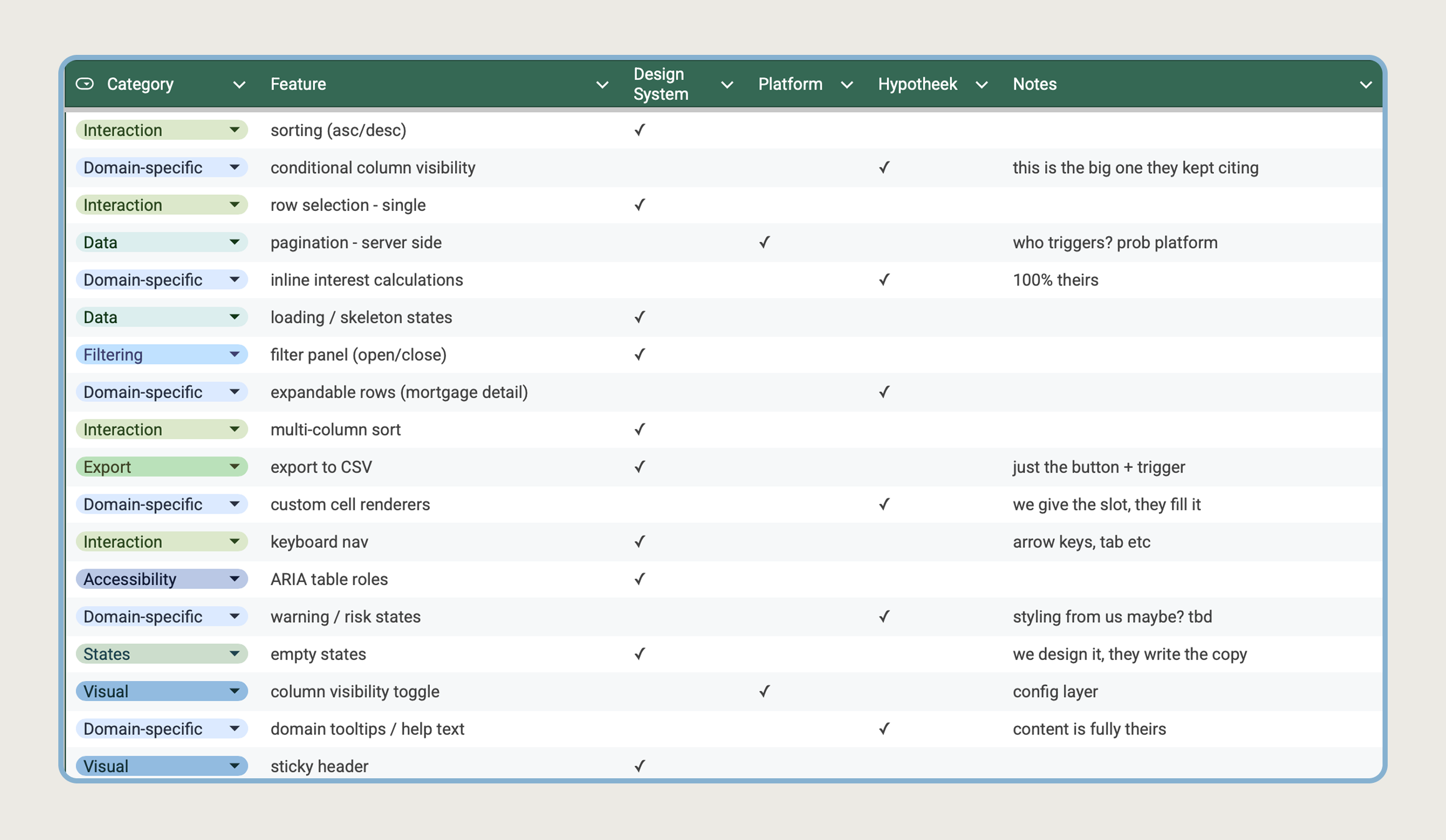
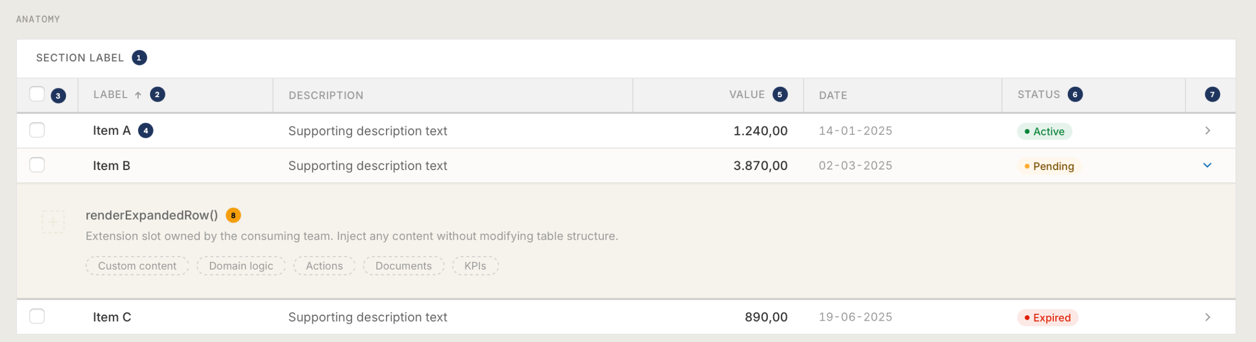
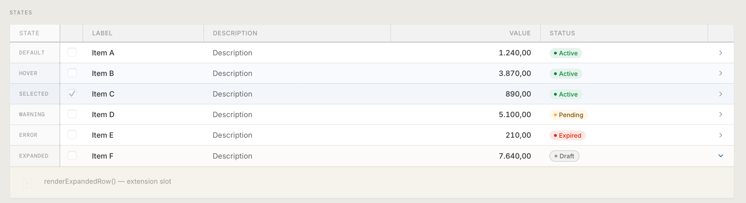
I designed the composable model and its components: a shared core with explicit extension points. Structure, behaviour, and accessibility shared; cell rendering, expansion slots, and conditional columns owned by Hypotheek.
Their edge cases stayed. No fork required.
①–⑦ DS infrastructure·⑧ Team extension slot
drag to reveal
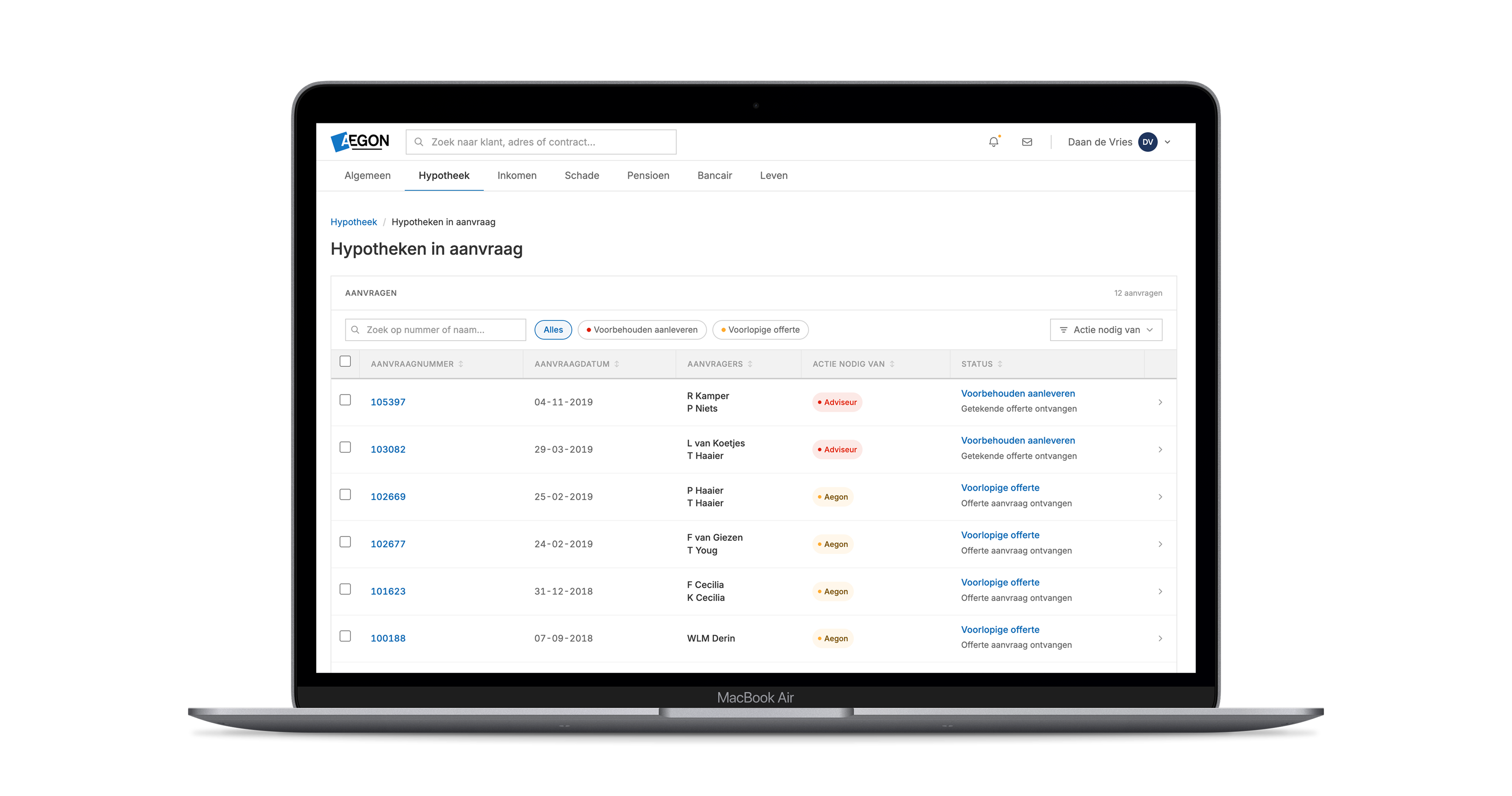
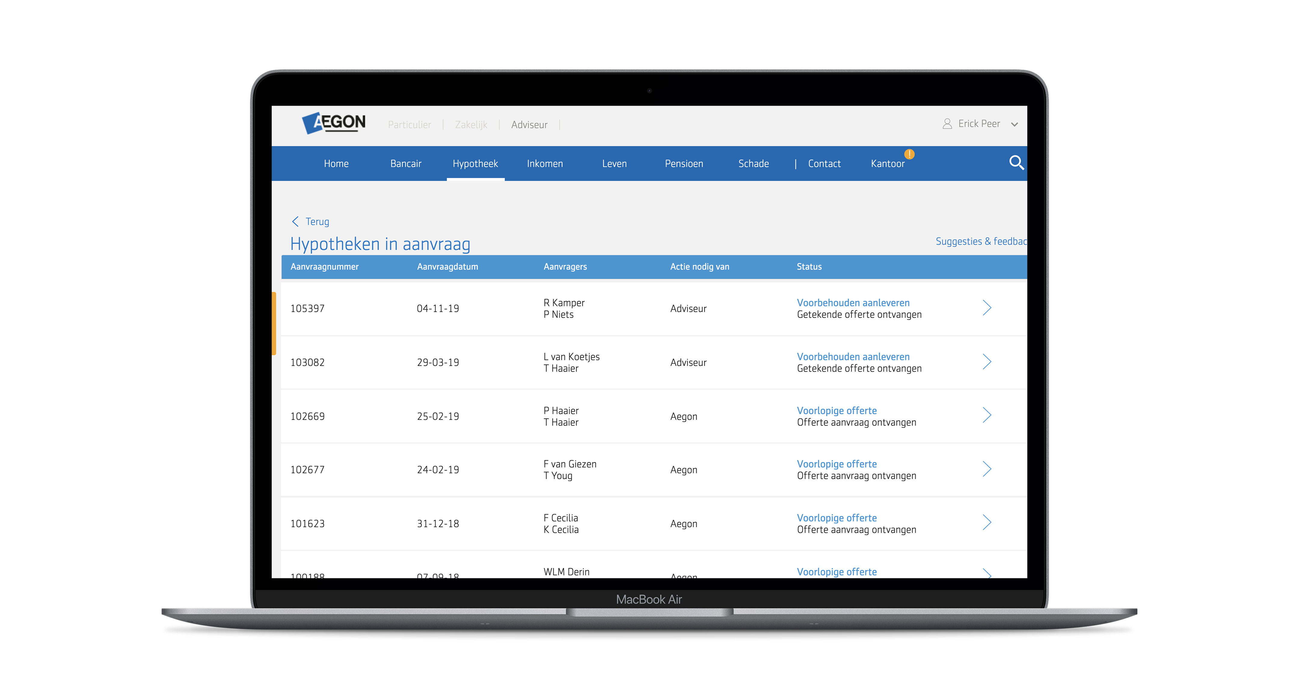
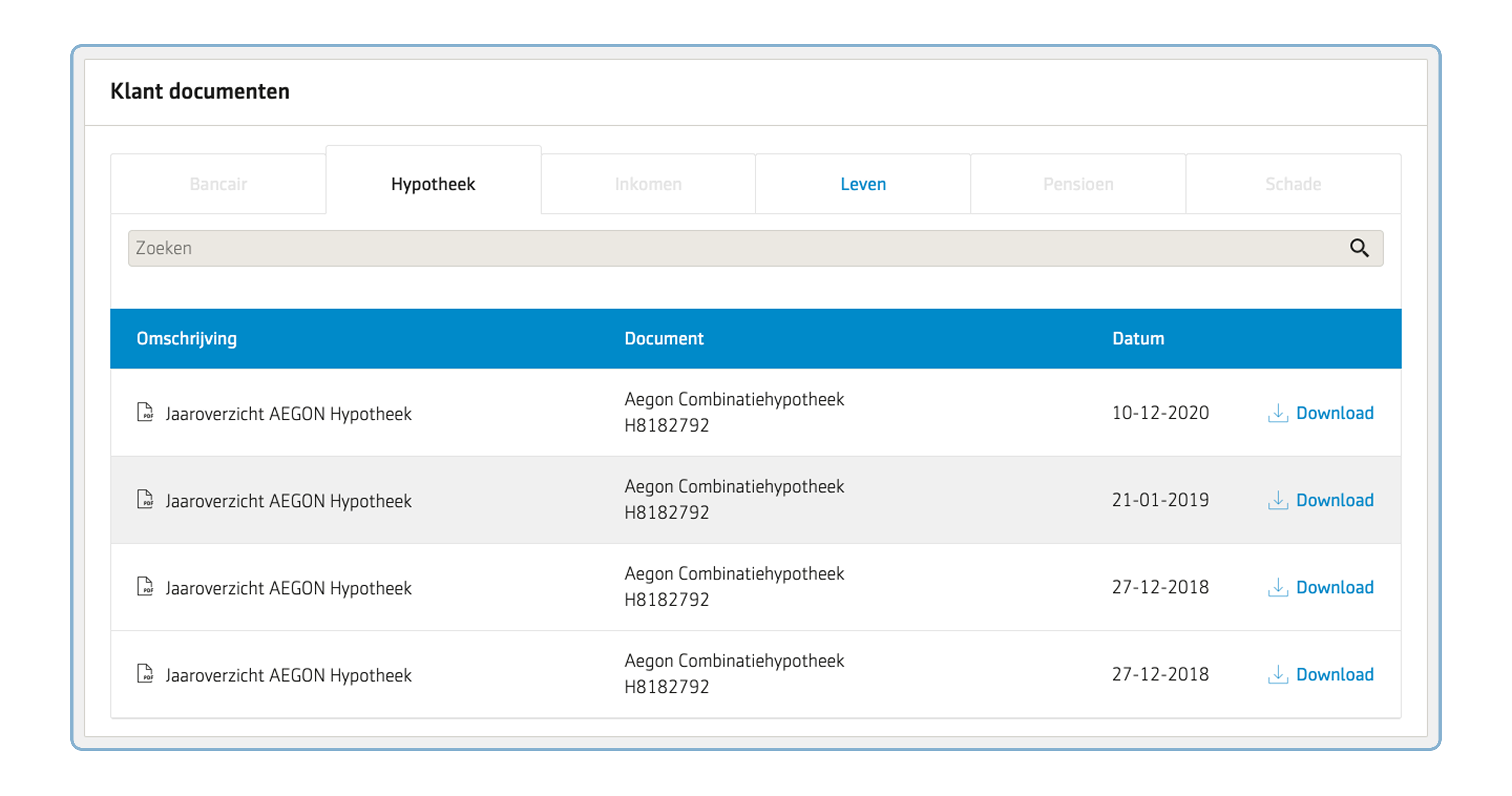
Hypotheek · Before & After
The same flow. Before and after Aeon.
Left: the legacy in-aanvraag UI, custom-built and detached from the system. Right: rebuilt on Aeon components.
Hypotheek in Aanvraag · Aeon
Domain-specific row expansion slots.
Custom cell renderers, custom mortgage-specific logic. The spacing, animation, and behavior are handled by the design system.
drag to reveal
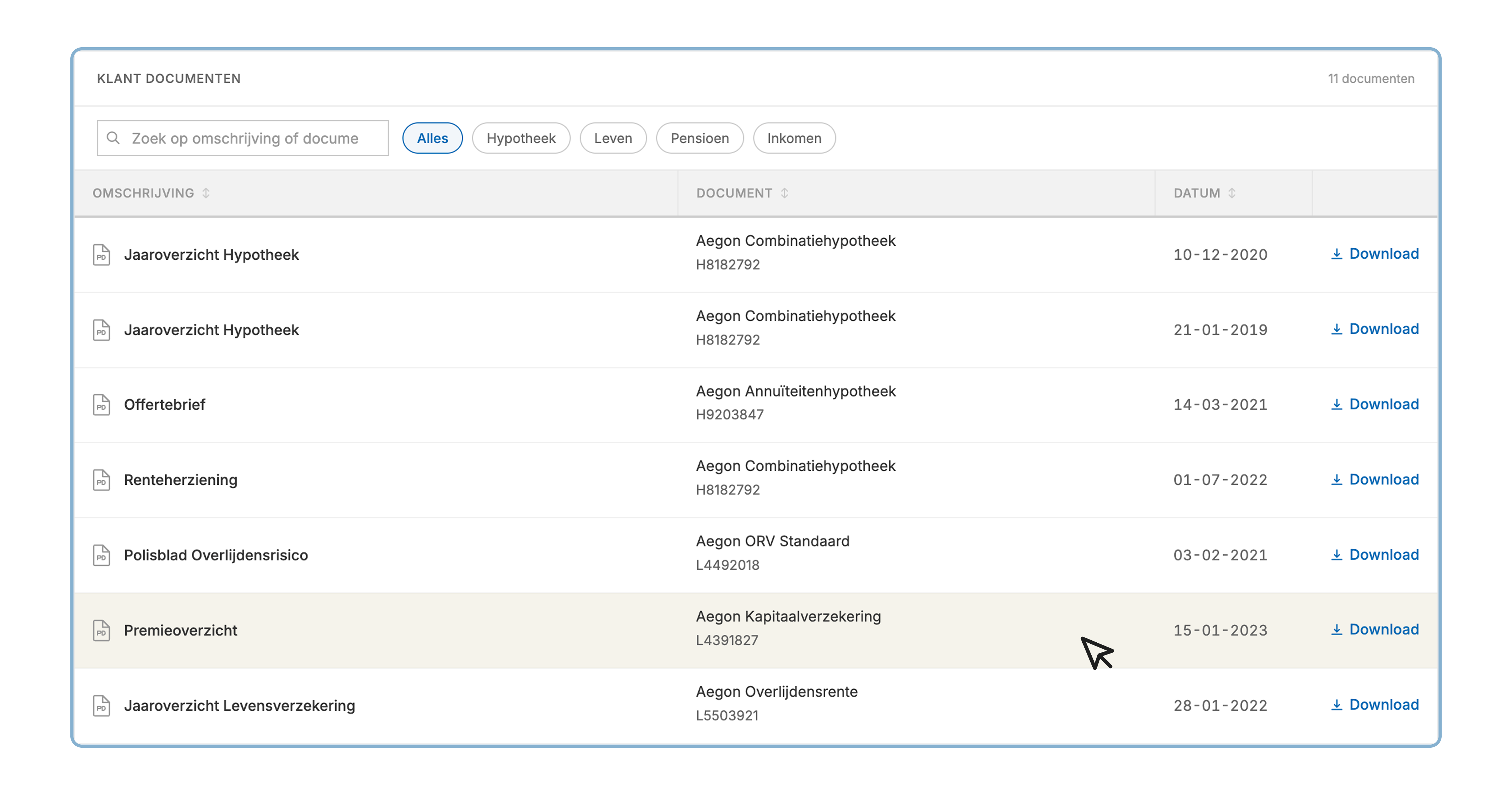
Klant Documenten · Before & After
Delivery
The biggest fear wasn't standards. It was waiting.
01
Direct weekly sync
Every open question gets a live answer that week. No ticket, no queue, no waiting to find out if you're blocked.
02
Every request gets a clear answer
Yes, not now, or no. Always with a reason. No ambiguity about where things stand or what comes next.
03
Exceptions documented, not blocked
Edge cases get a temporary exception and a note. The system stays intact. The team ships on time.
Outcomes
Custom tables 3 → 1.
A11y defects down 62%.
Data Table coverage near 90%.
Sources
Component audit before and after rollout·A11y audit pre/post DS adoption·Screen audit, Hypotheek, rollout phase 1
Reflection
What earned trust. What I should have prevented.
What earned trust
What I should have prevented
The reframe was the project
"We can't conform" was data, not pushback to overcome. Listening first turned a hostile team into a design partner. That's the only reason adoption worked.
Engaged Hypotheek six months too late
Should have been embedded with them from week one of the DS. By the time we showed up they'd already built three custom tables. Resistance is cheaper to prevent than to reverse.
Ship the contract before the components
The swimlane was the artifact that won them over. Architectural clarity beat visual polish.
Got Hypotheek, missed the room
While I was earning one team's trust, three other teams were quietly building around the system. I was so focused on the hardest team that I stopped paying attention to the easy ones drifting away.
Accessibility
♿
WCAG 2.2 AA
Zero accessibility regressions. Two consecutive quarters.
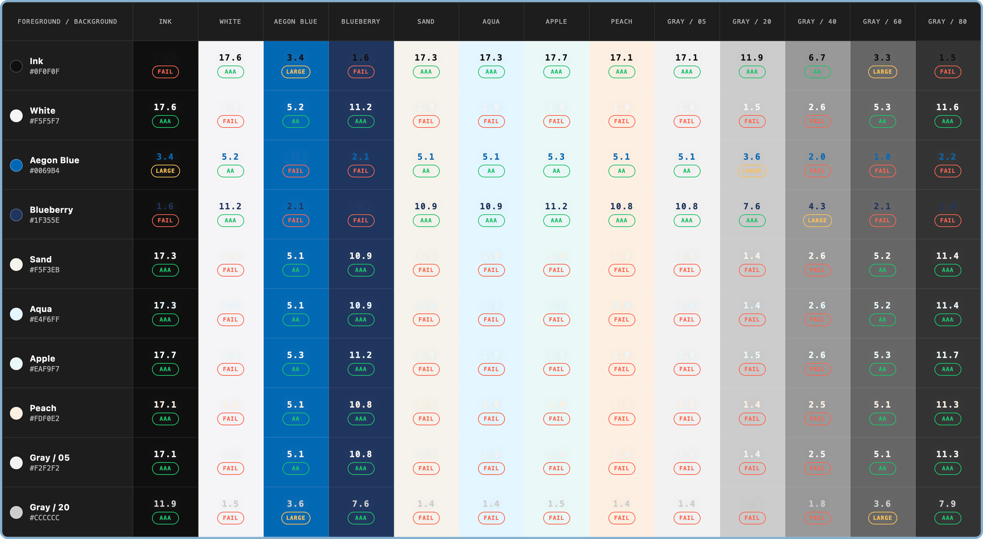
Audited all components against WCAG 2.2 AA: focus indicators (2.4.11), target sizes (2.5.8), dragging alternatives (2.5.7). Updated contrast tokens for every semantic state.
Side projects
Things I build when nobody asked.
Tussenin
A Dutch practice workspace built with Claude Code, where every mistake becomes the next drill.
No. Dutch citizen, full EU work authorization. No sponsorship needed.
Are you open to working on-site?+
Yes. Based in Utrecht, well-connected to Amsterdam, Den Haag, Eindhoven, and Rotterdam. Hybrid is my natural default, happy to negotiate the on-site split. Face-to-face is preferred for collabs.
What's your availability?+
1-month notice period.
Do you work well in organizations without an existing design system?+
Starting from scratch without a clear brief is familiar territory, sometimes preferable. Chaos can be fun if you're enabled.
Are you a solo IC or do you prefer managing/leading a team?+
Strongly IC. I do my best work owning a problem end-to-end. I like coaching and giving direct feedback, but managing headcount isn't where I want to spend energy.
The craft side matters to me: I still want to be close to the work, doing the research, making the calls, pushing the visual quality. What also genuinely excites me is directing LLM agents as part of that workflow. I set the brief, the system executes, I review and steer. That's the kind of leverage I'm after.
Presentation preflight
Best viewed fullscreen.
This deck is designed for a 16:9 presentation viewport. Fullscreen keeps spacing, image scale, and slide navigation crisp.
Window is small for this deck. Fullscreen recommended.